Our Logo
 Triple Nine Resources Ltd takes pride in its unique cultural and corporate identity which is reflected in our company logo. Much of its design incorporates symbolism from Aboriginal culture with particular influence from the Mi’kmaq heritage prevalent on the west coast of Newfoundland.
The chosen colors are significant as the black traditionally represents Mother Earth for First Nation People. The red speaks of fire; white, air; and blue, water. These elements are cornerstones of Native spirituality and signify the enduring balance and interconnectedness of the natural world.
The stylized eagle feather is a powerful symbol within the Aboriginal culture as it embodies the eagle’s qualities of courage and wisdom.
The dream catcher, in all its interpretations, reminds us of the importance of our dreams and the valuable lessons they hold for us.
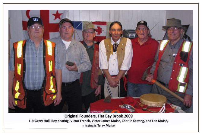
Finally, the crossed rock hammers are a tribute to the tenacity and vision of an enthusiastic group of seasoned prospectors who have come together to form the heart of this ongoing venture.
